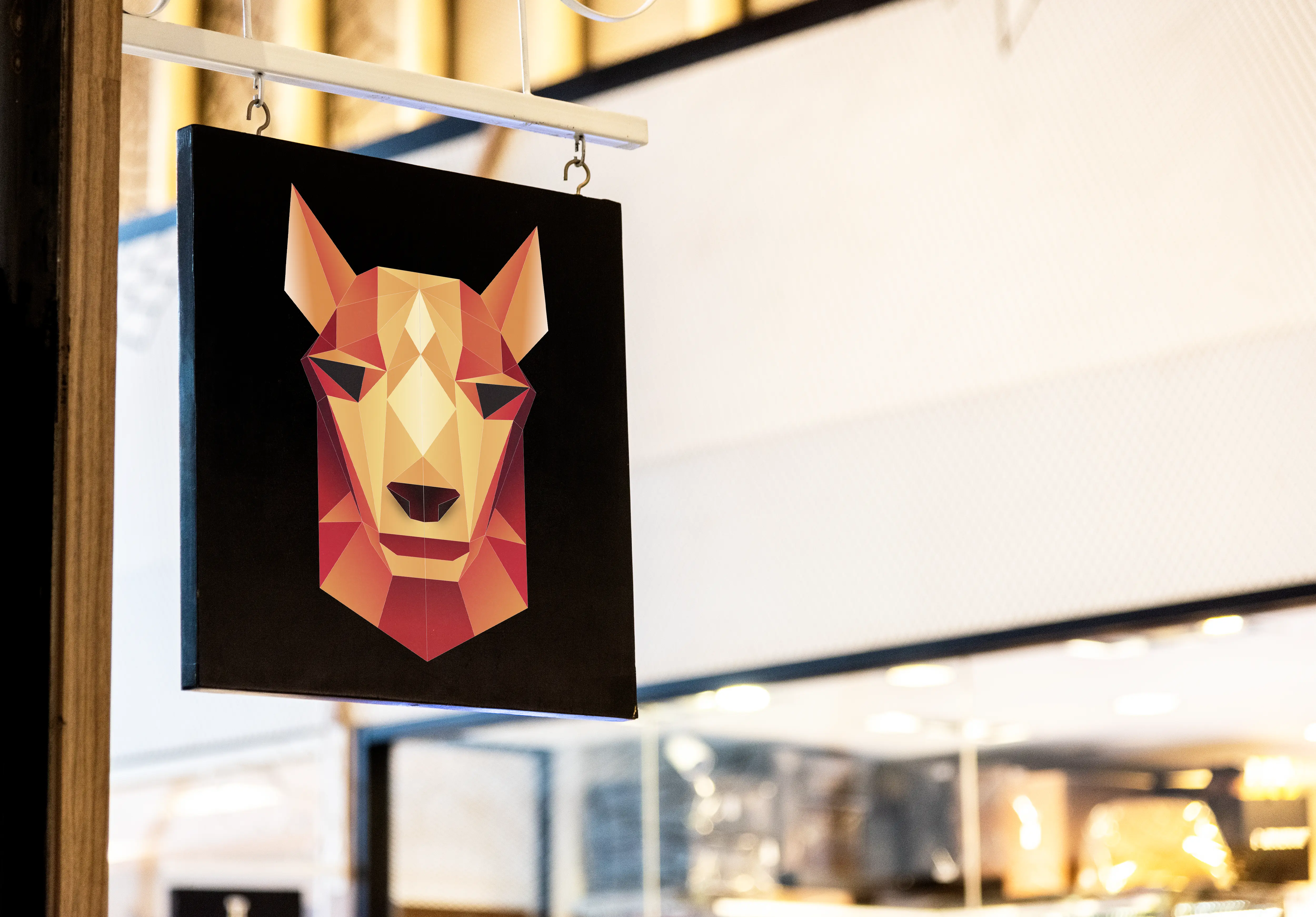
The concept draws from the elegance of Japanese minimalism and the expressive vibrancy of Peruvian design. This duality is reflected in a logo that merges flowing, calligraphic strokes with structured, geometric motifs—creating a symbol that feels both refined and full of character. A rich, contrasting color palette—rooted in the earthy tones of Peru and the deep blues of traditional Japanese ceramics—adds depth and distinction.
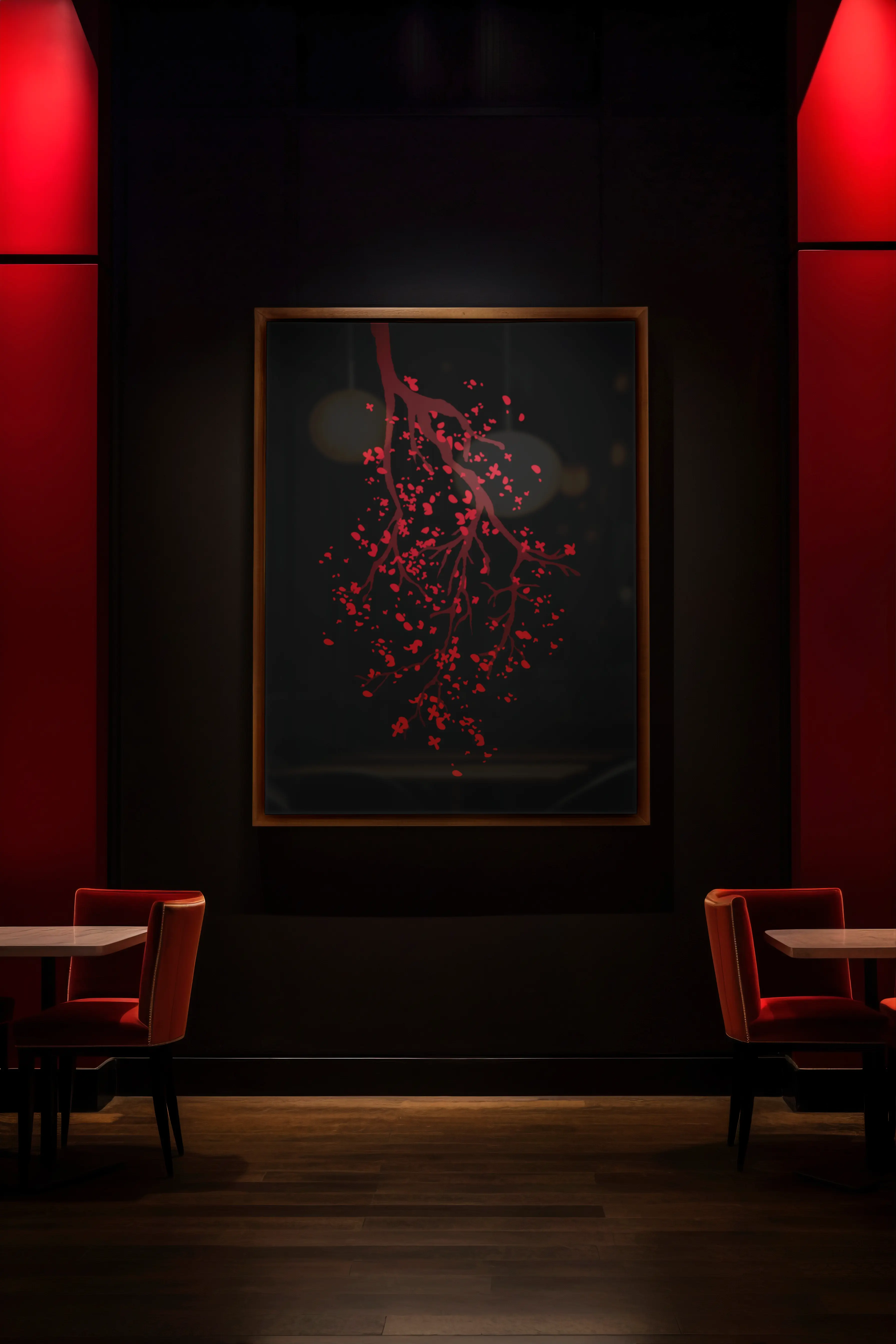
Typography plays a central role, combining clean sans-serifs with handcrafted, organic touches to highlight the balance between precision and tradition. The visual identity extends across menus, packaging, signage, digital platforms, and spatial design, ensuring a cohesive and immersive brand experience.
The result is a contemporary and culturally layered identity that captures the heart of Japeru: a place where flavors collide, cultures converse, and every detail invites curiosity.
Visual identity
Restaurant branding
Logo
Typography
Menu Design
Concept Creation
Design Manual